Web design: HTML forms
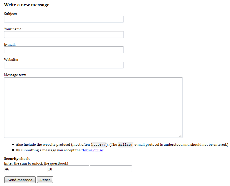
The form used to submit messages to the guestbook hasn’t changed either in many years. The original markup was
<h2 id="writeMsg">Write a new message</h2>

<form id="msg" method="post" action="gb_post.asp">

<p>Subject:<br /><input type="text" name="fTitle" style="width:400px;"/></p>
<p>Your name:<br /><input type="text" name="fName" style="width:400px;" /></p>
<p>E-mail:<br /><input type="text" name="fMail" style="width:400px;" /></p>
<p>Website:<br /><input type="text" name="fWeb" style="width:400px;" /></p>
<p>Message text:<br /><textarea name="fMsg" cols="74" rows="12" style="width:600px; height:200px;"></textarea></p>

<ul>
    <li>Also include the website protocol (most often <code>http://</code>).
      (The <code>mailto:</code> e-mail protocol is understood and should not be entered.)</li>
    <li>By submitting a message you accept the "<a href="gb_rules.asp">terms of use</a>".</li>
</ul>


<p><strong>Security check</strong><br />Enter the sum to unlock the questbook!<br />
<input type="text" name="security1" readonly="readonly" value="16" />
<input type="text" name="security2" readonly="readonly" value="26" />
<input type="text" name="security3" />
</p>

<p><input type="submit" value="Send message" /> <input type="reset" value="Reset" /></p>

</form>
the rendering of which is given below.

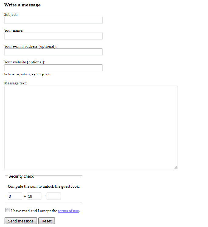
I have now changed this to
<section id="writeMsg">

  <h2>Write a message</h2>

  <form method="post" action="gb_post.asp">

    <p>
      <label for="InputTitle">Subject:</label>
      <input id="InputTitle" name="fTitle" type="text" size="50" required="required">
    </p>
    <p>
      <label for="InputName">Your name:</label>
      <input id="InputName" name="fName" type="text" size="50" required="required">
    </p>
    <p>
      <label for="InputMail">Your e-mail address (optional):</label>
      <input id="InputMail" name="fMail" type="email" size="50">
    </p>
    <p>
      <label for="InputWeb">Your website (optional):</label>
      <input id="InputWeb" name="fWeb" type="url" size="50">
      <small>Include the protocol, e.g. <kbd>http://</kbd>.</small>
    </p>
    <p>
      <label for="InputMsg">Message text:</label>
      <textarea id="InputMsg" name="fMsg" cols="74" rows="12" required="required"></textarea>
    </p>

    <fieldset>
      <legend>Security check</legend>
      <p>Compute the sum to unlock the guestbook.</p>
      <input name="security1" readonly="readonly" value="3" type="text" size="4"> +
      <input name="security2" readonly="readonly" value="19" type="text" size="4"> =
      <input name="security3" type="text" size="4" autocomplete="off" required="required"
        oninput="security3.setCustomValidity(parseInt(security1.value) + parseInt(security2.value) !=
        parseInt(security3.value) ? 'Incorrect value.' : '')">
    </fieldset>

    <p>
      <input id="InputAcceptRules" type="checkbox" name="fAcceptRules" value="yes" required="required" />
      <label for="InputAcceptRules">I have read and I accept the
        <a href="gb_rules.asp" target="_blank">terms of use</a>.</label>
    </p>

    <p>
      <input value="Send message" type="submit">
      <input value="Reset" type="reset">
    </p>

  </form>

</section>
which looks like

There are quite a few improvements:
- The entire section is wrapped inside a semantic
<section>element. - The form controls no longer have the very WET and (inappropriately) inline style attributes.
- The labels are marked up using the
<label>element. Besides being more semantic in general, this also gives the labels a different behaviour in a visual browser. - The inappropriate use of
<br>is removed; instead each ‘line’ is a paragraph. The default rendering of this markup would put the text fields to the right of the labels (in an unaligned fashion), but I use CSS to fix that. - The ‘security check’ is wrapped inside a
<fieldset>element with a<legend>. - The sizes of the input fields are specified.
- I use specific types of input controls depending on the kind of data format expected:
type=emailandtype=url. This will help the user agent give relevant autocomplete suggestions, display the appropriate on-screen keyboard, and validate the form before it is submitted. - The mandatory fields are marked up using the
requiredattribute to enable user-friendly client-side validation (done automatically by the user agent). - The
security3element has autocomplete turned off, since previous values are irrelevant. - The
security3element has a custom validation requirement. If an incorrect value is entered by the user, the user agent will display the specified error message in an appropriate fashion. - The optional fields are now clearly marked as optional.
- The hint about the protocol in the website field is now given next to the input field itself. It is marked up using the
<small>element, as suggested in the HTML5 specification. - The link to the terms of use has been made into a checkbox, which is common practice. Hence, I no longer need the UL that I previously used. Instead, information is given where it is needed.
In order to style this, a very small piece of CSS is needed:
#writeMsg label + input, #writeMsg label + textarea {
  display: block;
}
#writeMsg fieldset {
  display: inline;
}
Indeed, I clearly want text fields and similar controls to be positioned below their labels, but I do want checkboxes and radio buttons, which precede their labels, to remain inline.
The second rule is needed to reduce the width of the fieldset.
Notice that labels, fieldsets, and legends are not new to HTML5 (and neither is good general design). On the other hand, the new types of input controls (type=email and type=url), the autocomplete attribute, and client-side validation are HTML5 additions.
