
Advanced authoring in Microsoft Word 2010
Introduction
I have always been very interested in the art of digital text authoring. In particular, I have always been extremely careful to do things the right way, such as separating content from presentation; in fact, already in gymnasieskolan, I gave a talk about this.
This is an article about using Microsoft Word for serious writing (such as technical articles or even books). Although Microsoft Word is arguably the world’s most used word processing software, it is a disappointing fact that Word really isn’t very good at this kind of advanced document authoring. Instability (yes, bugs), a lack of many important features, and bad design choices make it needlessly difficult to create decorated and easy-to-maintain documents. Nevertheless, with a firm understanding of both the existing features of Word as well as of the limitations (and bugs) of the software, it is possible (even fairly easy) to create good-looking documents that are easy to maintain. But you have to learn a few tricks and – sadly – simply refrain from doing a small number of things that ‘cannot’ be done. In the article, I will not only point out these things, but I will also mention how easily the problems are solved using superior document authoring tools such as HTML + CSS.
Although this article focuses on Microsoft Word 2010, most of the content applies equally well to Word 2007 and Word 2013.
Styles
The right way to use Word is to use styles. Therefore, we begin with a thorough introduction to styles.
What are styles?
The most basic principle related to digital word processing is the separation of content and presentation; you should not mix these.
For example, suppose you want to create a heading. You could enter the heading text (the content), select it, and then apply some presentational attributes directly to it (large text size, boldface, maybe coloured, maybe underlined). Then you have mixed content and presentation. Notice that you need to memorise the font settings and repeat the exact same font commands every time you write a new heading of the same level.
Or you could enter the heading text and tell Word that the current paragraph is a heading (and what level it has); in other words, you tell Word what logical type of paragraph it is. In this case, you only specify the contents, and leave the styling (or presentation) as a separate question to be dealt with later. Knowing that the paragraph is a heading (of some level), Word will automatically style it using its default presentational rules for such headings (large text size, boldface, …). These presentational rules are associated to the heading (of that level) as a type of paragraph, and not to the particular heading you just entered. Consequently, you have separated content and presentation. Of course, you may change the presentational rules associated to each logical type of paragraph (like the different levels of headings), so you still get perfect control over the appearance of the document.
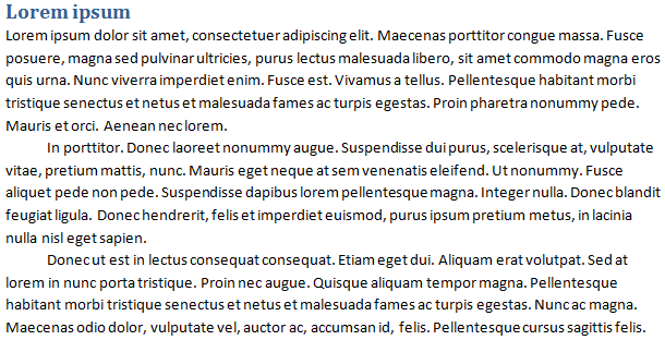
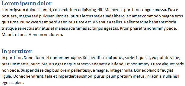
As a concrete example, consider the following very primitive document. The document consists of two sections, each with its own heading. The first section contains three paragraphs of text, and the second section contains one paragraph of text.
| Direct formatting | Separation of content and presentation |
|---|---|
|
Content:
|
Content:
The document also contains a ‘style sheet’ that specifies the presentational attributes of each logical type of paragraph:
|
In the terminology of Microsoft Word, the ‘types’ of paragraphs are (somewhat unfortunately) called ‘styles’. Hence, the good way of using Word is to use styles, to separate content from presentation. Technically, in Word, a ‘style’ is not much more than a named set of presentational attributes and each paragraph in the text is associated with some particular style. In the very simple example above, two styles are used: ‘Heading’ and ‘Normal paragraph’.
There are only advantages to this approach:
-
As already hinted, it becomes much easier and much more convenient to write the text since you do not have to keep entering the same presentational attributes over and over again. You only need to specify the type of each paragraph (like ‘Heading 1’, ‘Heading 2’, …, ‘Warning box’ etc.).
-
All body text, headings of the same level, figure captions, warning boxes, block quotations, and other logical kinds of paragraphs will necessarily be given the exact same formatting throughout the document, which makes the document look professional.
-
There is also a huge benefit in terms of maintainability.
Suppose you have a 750-page document with a lot of headings and you realise that you want to change the colour of every instance of the third level of heading throughout the document. If you have not separated content from presentation, you have to find all instances of third-level headings, and change these one at a time. (Of course, there is a risk that you’ll miss one or two of these instances, making the document look bad.) On the other hand, if you have used styles, you simply have to change the formatting of the ‘Heading 3’ style, and the entire document will be restyled automatically.
-
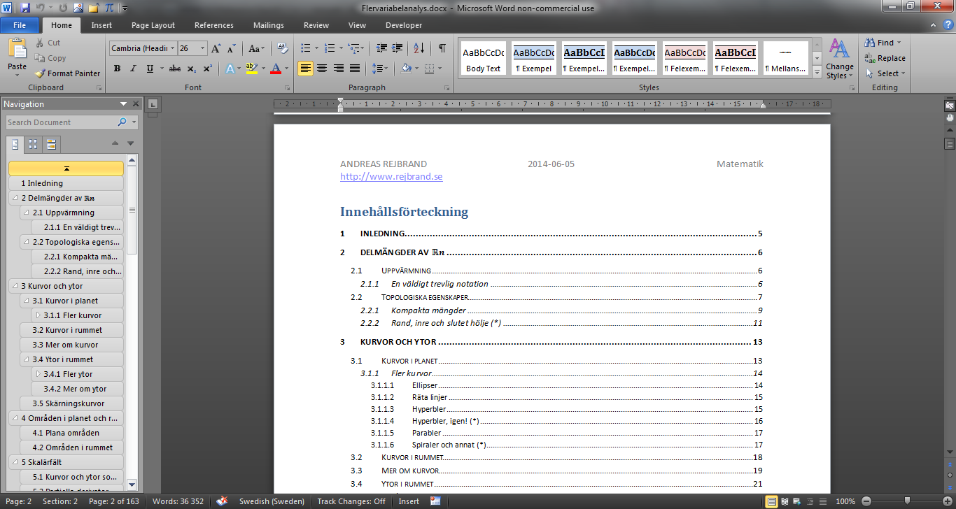
Since Word knows the outline of the document (that is, the heading structure), it can automatically create a table of contents (TOC). This can be shown in the user interface and it can be included in the document itself. In either case, it is automatically updated when the document is changed. Creating a TOC manually in even a moderately large document, and keeping it up-to-date as you work on the text, is almost unfeasible.
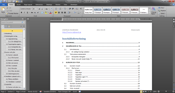
In the screenshot above, both examples of TOCs are shown. (Another thing that is shown is an annoying limitation of Microsoft Word: while the second top-level heading contains the mathematical symbol ℝn, the superscript is simply ignored in both TOCs.)
-
If the document is marked up appropriately using styles (that is, headings, warning boxes, and other special types of paragraphs are given appropriately-named styles describing their type), it is easy to restyle the document, as suggested above. You only need to change the presentational attributes of the styles; you do not even need to touch the content. The same content can thus easily be used to create documents with very different visual appearance. (In Word, restyling is essentially restricted to fonts and things like paragraph spacing, border, and background colour. In HTML, on the other hand, two different style sheets can produce vastly different results from the same hypertext content.)
-
Search engines and assistive technology software (such as screen readers for the visually impaired) will understand the structure of the document better if it is marked up semantically. For example, the user can ask the computer to enumerate the headings, or to go to a specific heading. Or the user could ask the computer if there are any warning boxes in the text. (However, semantic mark-up is more refined in HTML compared to Word.)
The reason why the ‘types’ of text are called ‘styles’ in Word is rather obvious; indeed, a ‘style’ contains information about the visual presentation, or style, of the paragraph and its text. However, a better term would be ‘type of paragraph’, or ‘class’. Indeed, the names of the ‘styles’ in the first example are ‘Heading’ and ‘Normal paragraph’, which describe the logical type of paragraph. In particular, the names are not ‘Big blue and bold text’ and ‘Small text’ which would describe the presentation. In addition, it is perfectly reasonable that the actual presentational attributes will change in the future (maybe the headings will be red instead). If so, the name ‘Heading’ will still be valid, but ‘Big blue and bold text’ might not be valid any more.
Also, in theory, the types of paragraphs are not only about presentational attributes (like font settings and paragraph spacing). Instead, the type also has semantic meaning by itself. For example, headings create the structure of the document (which can be used to navigate the document and create automatic tables of contents). For instance, it is certainly possible that there are two ‘styles’ (‘classes’) that have the exact same presentational attributes, but differ in semantic meaning. One plausible example is ‘Heading 5’ and ‘Keyword’, where the first is the fifth-level heading and the second is used to highlight keywords in the text. (Perhaps both are blue, bold, and 11 pt.) Although their ‘styles’, in the sense of presentational attributes, are identical, only instances of the first one will participate in the document outline and be displayed in TOCs.
As a second example, if you write a mathematics textbook, you can use a special ‘style’ (or ‘class’) named ‘Definition Box’. Not only might this be used to create a black solid border around the paragraph – you can also tell Word to extract all the definitions in the text and create a list of them (at least in theory).
Consequently, the point is that a ‘class’ (or ‘style’ as it is called in Word) has semantic value on its own. The fact that you can connect presentational attributes to classes is only one of the applications of classes.
From a more abstract point of view, the fact that the ‘classes’ should be named after the logical types of the paragraphs and not after the presentational attributes associated to them also follows from the general rule that content and presentation should be separated. Since the classes are associated to the content, they must not make references to any particular presentational attributes.
In conclusion, so far:
-
Never apply presentational attributes (such as font or paragraph settings) directly to the text.
-
Instead, make sure that every paragraph has the right style, like ‘Normal’, ‘Heading 1’, ‘Heading 2’, …, ‘Figure Caption’, ‘Example Heading’, ‘Definition Box’, ‘Theorem’, or ‘Proof Box’ which describes the semantics (or type) of the paragraph.
-
Then adjust freely the presentational attributes of the styles.
Using styles
Now, how does all this work in practice in Microsoft Word? Actually, it is very simple. You set the style of a paragraph using the Styles group on the Home tab in the ribbon in Microsoft Word 2007 and later.
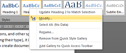
You can change the presentational attributes (such as font and paragraph settings) of a particular style by right-clicking the style (in the ribbon) and selecting ‘Modify…’.
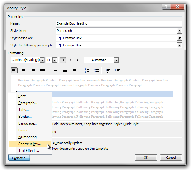
In the dialog box that is shown, you can change the general settings of the style (such as the style of the following paragraph) and some simple font and paragraph settings. However, you often need to use the Format button in the bottom-left corner of the dialog box to get access to the full font and paragraph settings.
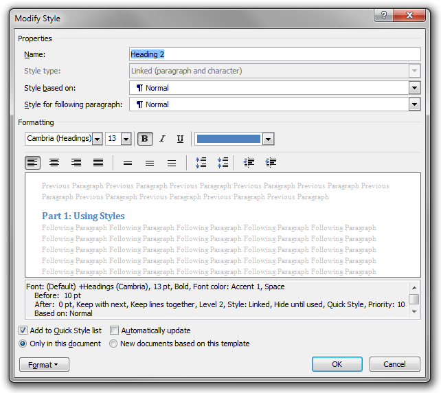
The ‘Style for following paragraph’ setting is very convenient. Here you enter the kind of paragraph that will normally be used immediately following paragraphs of the style you are currently revising. For example, if you have coloured example boxes in a mathematics textbook, you might have an ‘Example Heading’ style that is to be followed by paragraphs of type ‘Example Body’. Similarly, the built-in heading styles (‘Heading 1’, ‘Heading 2’, …) use ‘Normal’ as the style for the following paragraph.
The effect of this setting is that the specified style (‘Style for following paragraph’) will be used for the new paragraph that is created when you press Return at the end of a paragraph of the current style. Word does not, however, enforce that paragraphs of the current style will always be followed by paragraphs of the specified style.
You can (and often should) create new styles. In the user interface, there are several ways of doing this. One is to press Alt+Shift+Ctrl+S to open the Styles tool window. In the bottom-left corner, there is a button called ‘New Style’ that will create a new style.
Among the most frequently used styles are the various levels of headings: ‘Heading 1’, ‘Heading 2’, ‘Heading 3’, and so on. (These are built-in.) You may set the style of the current paragraph to one of these using keyboard shortcuts, namely, Alt+Shift+Left and Alt+Shift+Right. If the current paragraph has style Heading N, these commands will change the heading to Heading (N−1) and Heading (N+1), respectively. On the other hand, if the current paragraph is not a heading, the former shortcut will change the style to the same style as the previous heading in the document, and the latter will change the style to the same style as the previous heading plus one.
Hence, Alt+Shift+Left is used to create a new section at the same level as the current one (a sibling), while Alt+Shift+Right is used to create a new subsection (the first one) in the current section. (In both cases, the current paragraph becomes the heading of the new section or subsection.)
Another very useful keyboard shortcut is Shift+Ctrl+S which will open (if needed) and bring focus to the Apply Styles tool window (not to be confused with the previously mentioned Styles tool window). This window can be used to apply a style by typing the name of the style. This is very convenient. For example, when I want to create a new coloured example box in a mathematics textbook I am writing, I simply press Shift+Ctrl+S, E (as in ‘Example’ which will be automatically completed), and Enter.
Occasionally, the shortcut Shift+Ctrl+N is useful, too. It will change the style of the current paragraph to ‘Normal’.
Heading styles
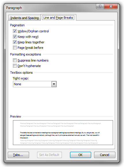
Let us talk more about headings. In Word, the default heading styles (named ‘Heading 1’, ‘Heading 2’, ‘Heading 3’, and so on) have paragraph settings appropriate to headings in particular. So, by using styles, you will also get these settings automatically (although they can be obtained manually as well, using direct paragraph formatting). The main benefit in this area is that Word will guarantee that a heading is not placed at the bottom of one page with the first paragraph in the new section starting at the top of the next page. This is because the styles of headings by default have the ‘Keep with next’ paragraph option set.
As mentioned earlier, Word will automatically generate the table of contents using the heading structure of the document. The best practice is to divide the entire text into ‘parts’ or ‘chapters’ using ‘Heading 1’, to divide these parts into sections using ‘Heading 2’, to divide the sections into subsections using ‘Heading 3’, and so on. Using this approach, you cannot use ‘Heading 1’ for the title of the document on the cover page. Instead, you should use the built-in ‘Title’ style for this one.
Of course, you could use ‘Heading 1’ on the cover page, for the title of the document, and then use ‘Heading 2’ as the highest level of heading inside the text. However, this will obviously have a negative effect on the generated TOC. It will also confuse assistive technologies, search engines, and other software reading the document.
Paragraphs and pagination
Basically, a Microsoft Word document consists of text divided into paragraphs. A new paragraph is created when the user presses the Return key. As discussed earlier, a paragraph can have many different logical roles: it might be a normal paragraph, a heading, an example box heading, an example box text paragraph, and so on.
Beware of some possible confusion. Here we use the term ‘paragraph’ in a technical sense, so even headings are paragraphs. But in non-technical contexts, the term ‘paragraph’ is usually reserved for the paragraphs of body text (excluding, among other things, headings).
Now, one way of creating a vertical space in a document is to press Return several times (more than once) in a row. Technically, this will create empty paragraphs, i.e., paragraphs that contain no text at all. For example, it is possible to increase the distance between paragraphs of body text by putting an empty paragraph between each couple of ‘real’ paragraphs (that is, you press Return twice when you need a new paragraph). Similarly, it is possible to add space before a major new section (before a ‘Heading 1’, say) by adding a number of empty paragraphs in front of it. It is also possible to make sure that a new section starts on a new page by adding a suitable number of empty paragraphs before it.
Don’t do this! It is extremely bad practice!
The reason you shouldn’t do this is because spacing is a matter of presentation, and so it should not be included in the content. The practical reasons are as follows:
-
Adding empty paragraphs between ‘real’ paragraphs to get more spacing gives only very crude control over the precise paragraph spacing. (Of course, you can change the font size of the empty paragraphs, but then you have to repeat the same font-size command in every similar empty paragraph, and you get all the problems associated with such direct formatting. You could use a style for that, but it is still very bad practice, since the empty paragraphs are purely presentational, and, as we will see, completely unnecessary.)
-
Adding space before a major heading also gives crude control and requires the user to remember the precise number (and size) of the empty paragraphs. In addition, if the new section (starting with a heading) happens to start on a new page, some of these empty paragraphs might end up moving the new section away from the top of the new page, which is very undesirable.
-
Putting the ‘right’ number of empty paragraphs before a new section, in order to move it to a new page, is extremely awkward. In particular, if you change the document somewhere in the middle, you have to revise the number of empty paragraphs before every new section in the document from this point. Changing a single paragraph on page 1 in a 750-page text forces you to revise the entire document manually.
So, you should never add empty paragraphs to the text. Never press Return twice in a row! But then how do you control the vertical spacing and pagination? The answer is to use the paragraph settings of styles.
To control the paragraph attributes of the body text in a document, you should create a special (paragraph) style for the body text instead of using the ‘Normal’ style (because other styles are based on this one). Let us choose the name ‘Body Text’. Also remember to change the heading styles (‘Heading 1’, …) so that they are followed by ‘Body Text’ and not by ‘Normal’.
Then it is simply a matter of setting appropriate paragraph settings for ‘Body Text’.
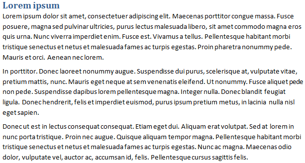
One common setting is to use vertical spacing between paragraphs. To accomplish this, simply set the ‘Spacing After’ value:
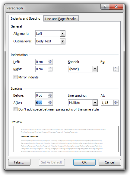
A value of 6 pt will produce the following result:
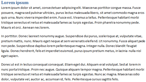
Increasing the spacing to 12 pt produces this result:
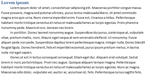
Another common way of separating paragraphs is to use indentation. To do this, set the ‘Space After’ value to zero, and instead add ‘First line’ special indentation:
The benefits of using a body text style (like this) are obvious:
-
You do not need to repeat the same paragraph formatting over and over again.
-
All paragraphs are guaranteed to look the same.
-
You get very precise control over the presentation.
-
It is easy to change the style and restyle the entire document automatically.
-
There are no empty paragraphs (which are semantically nonsensical).
However, there is one annoying limitation in Microsoft Word. A very common way of formatting paragraphs is to use indentation, as in the last example, but with the additional rule that only (body text) paragraphs that are preceded by other (body text) paragraphs should be indented. (For example, the first paragraph of body text after a heading should not be indented.) Hence, you would like to achieve this result:
Unfortunately, it is not possible to create such rules in Microsoft Word styles. There are a number of fairly obvious workarounds (like using two different paragraph styles or using direct formatting to remove indentation), but no really convenient and robust one. For comparison, in HTML and CSS, this problem does not exist, because the very simple selector p + p will match every (body-text) paragraph immediately preceded by another (body-text) paragraph.
Anyway, let us return to our example.
Of course, you can also adjust the spacing before and after headings. In the following example, the spacing before ‘Heading 1’ is 24 pt, and the spacing after is 0 pt.
In the next image, the spacing before is increased to 48 pt and the spacing after is increased to 12 pt.
If the second heading would need to end up on a new page, it would start at the very top of it, as one would like. In other words, it would not be pushed down 48 pt from the upper margin of the page.
Notice that as the value of ‘Space Before’ is increased, the more likely it becomes that the heading will start on a new page. Indeed, suppose you require N pt before the heading. Also suppose that the height of the heading, the space between the heading and the first paragraph after it, and the height of the first couple of lines of body text after the heading together sum up to X pt. Then N + X pt of space is needed for the heading to stay on the first page. Hence, as N grows, it becomes less likely that it will fit on the first page, and – consequently – more likely that it will be moved to the top of the next page.
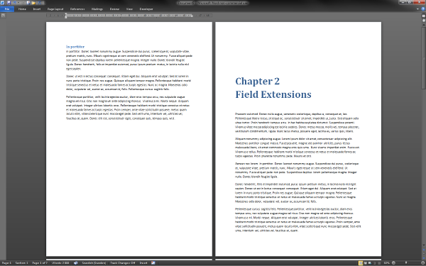
If N is big and the heading is moved to the next page, there might be quite a lot of space left on the first page. But this is all good, and what you would expect for important headings like chapter headings. In fact, you probably always want a chapter to start on a new page, and this is very easy to do in Word. Simply turn on the paragraph setting named ‘Page break before’ on ‘Heading 1’. This will automatically produce the nice result below.
Notice that, if the heading is moved to a new page because of the ‘Page break before’ option, it will be pushed down from the top of the page according to the value of ‘Space Before’. This is good, because it is a common practice to put the chapter heading a bit down on the page.
Thus, the best way of making sure some particular type of paragraph (such as a particular level of heading or the caption of a really large table) starts at the top of a new page is to use styles and paragraph settings. In particular, this is much better than the really stupid method described at the beginning of this article. However, for completeness, let us end by noting that there is a third method, not as elegant as the best one, but still far superior to the worst one: you may manually insert a page break in the document using Ctrl+Return. The paragraph following a page break will always start on a new page.
In conclusion:
-
Never create empty paragraphs (never press Return twice).
-
Instead, you control vertical spacing and pagination using the paragraph settings of the styles you use.
-
This makes it much easier to write and maintain the document, and the result will look better. You do less, and get a better result.
Soft returns
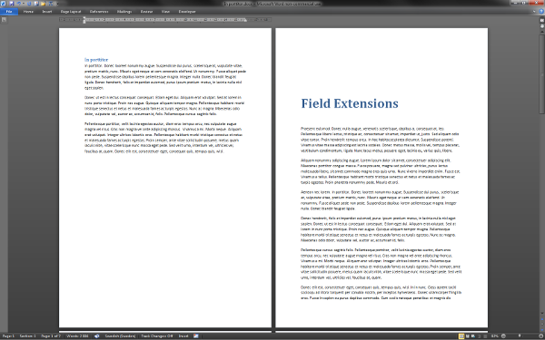
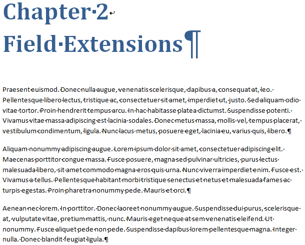
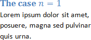
A few paragraphs above, we gave a pretty example of a chapter break. But what if we want it to look like this?
In this picture, the chapter heading (Heading 1) is split on two lines. How is this achieved? Of course, it could simply be a case of two paragraphs (in the technical sense); the first would contain the text ‘Chapter 2’, and the second would contain the text ‘Field Extensions’. That would be very bad, however, because then the semantics of ‘Heading 1’ would imply that there is one (empty!) chapter named ‘Chapter 2’, immediately followed by a new chapter named ‘Field Extensions’. That is what would be displayed in the TOC, and that is what screen readers would assume.
Clearly we cannot do it like that. Instead, the solution is to insert a soft return using Shift+Return. This will move the caret to the beginning of the next line, but it will not create a new logical paragraph. Hence, in the image above, there is only one paragraph with the style ‘Heading 1’, and it contains the text ‘Chapter 2’, followed by a soft return, followed by ‘Field Extensions’.
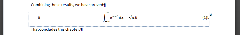
By the way, what is the easiest way to tell a soft return from a true paragraph break? The answer is to turn on the display of formatting symbols by pressing Shift+Ctrl+8. (On US keyboards, an alternative description of the shortcut is Ctrl+*, but on Swedish keyboards the alternative description is Ctrl+(.) You can also press the ¶ button in the Paragraph group on the Home tab in the ribbon.
When this feature is turned on, paragraph breaks are indicated by the ¶ symbol while soft returns are indicated by ↲, as illustrated in the following image, where you also see that spaces are indicated by middle dots (•).
Lists
Creating simple lists (bulleted, numbered, and multilevel) in Word is very easy, of course. Unfortunately, it is not possible to add ‘advanced’ content in list items in any natural way.
In particular, suppose you want some list item to contain several paragraphs of texts. This is not uncommon; in fact, we used such list items in a previous section in this article. How to achieve this in Word?
One approach is to press Return in the list item. But this will leave the current list item, and create a new list item. However, if you press Backspace in the new item, the bullet (or number) will go away, but the left indent will remain. Consequently, the visual appearance is as if you are still within the first list item (but on a new line). You can then press Return again to create an empty paragraph to separate the two actual paragraphs in the list item. A better approach is to change the ‘List Paragraph’ style by unchecking the ‘Don’t add space between paragraphs of the same style’ paragraph settings, so you can use the paragraph spacing settings to add vertical space, and do not need to create (semantically nonsensical) empty paragraphs. Do this!
In this approach, to start a new item (bullet) in the list, you only have to click the bullet icon (or numbered list icon, or multilevel list icon) in the ribbon.
In the following example, this method is used to create paragraphs in list items. Formatting symbols are displayed in order to reveal the presence of paragraph breaks (¶).
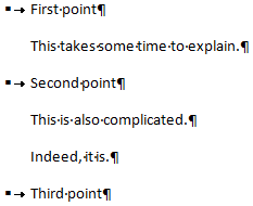
This sample contains six paragraphs, three of which are bulleted. Semantically, it is not really obvious that the second paragraph is part of the first list item (although the presence of the ‘List Paragraph’ style suggests this). However, the method works well in practice, and you get precise control over the spacing.
A second approach is to press Shift+Return in the list item twice to create two soft returns and hence an empty visual line, as in the following image. Soft line breaks are represented by ↲.
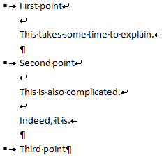
Here there are only three paragraphs, and each has a bullet. The advantage of this approach is that the scopes of the list items are crystal clear. The disadvantage is that the paragraphs inside the items are not paragraphs at all (each list item consists of a single paragraph). Besides being semantically dubious, this also makes precise styling of the vertical spacing very awkward.
Probably the best practice is to employ the first method. As an aside, let us note that this entire issue does not exist in HTML, where each list item is an element that may contain any content, including any number of paragraphs.
Boxes
In many types of text, you want to create boxes with borders and/or different background colour. For example, a mathematics textbook might contain examples in coloured boxes, and theorems and proofs in boxes with solid black borders. In Microsoft Word, it is easy to create simple boxes.
As always one could use direct formatting to create boxes, but it is much better to use styles, for the usual reasons:
- You don’t have to remember and repeat the same formatting commands every time you need a new box; instead, you simply tell Word what type of box you want.
- All boxes of the same kind are guaranteed to have the exact same formatting.
- It becomes easy to change the formatting of every box of the same kind at once.
- You can use software to enumerate or extract boxes of some kind.
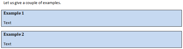
For example, suppose you want to create boxes like the following:
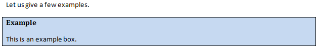
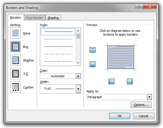
To do this, create a new paragraph style named ‘Example Box’. Make sure the ‘Space After’ and ‘Space Before’ values are suitable. If you use vertical space to separate paragraphs of body text, you should probably use the very same values for ‘Example Box’. Also add the border and the shading.
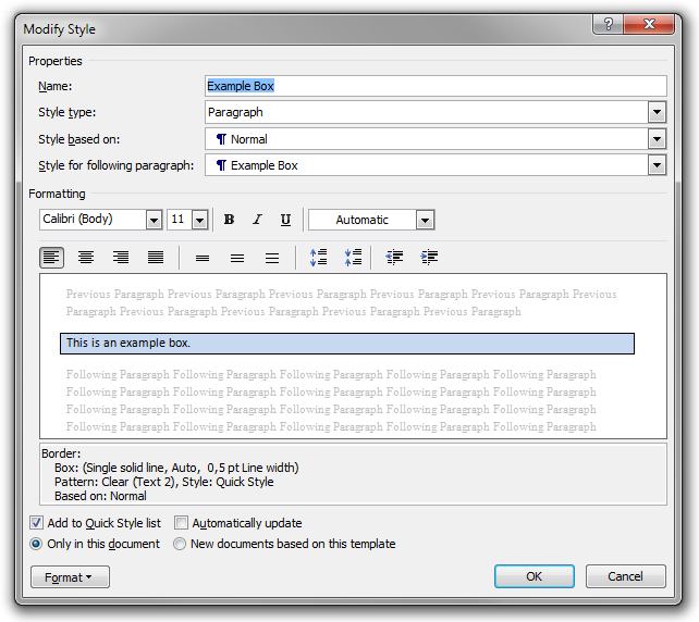
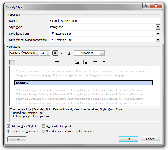
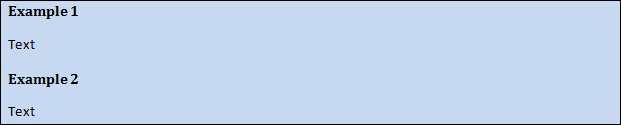
Now we create a new style named ‘Example Box Heading’. Set the ‘Style based on’ value to ‘Example box’; this will make ‘Example Box Heading’ inherit the properties of ‘Example Box’ like the background and border. Also make sure that ‘Style for following paragraph’ is ‘Example Box’, since we want an example box heading to be followed by an example box paragraph. To format the heading, it is a good idea to use boldface; if you like, you can also increase the font size. Finally, since this is a heading of the box, you should set the ‘Keep with next’ (and ‘Keep lines together’) paragraph option.
Now we are all set up.
In order to create an example box in your document, simply activate the ‘Example Box Header’ style, for instance by pressing Shift+Ctrl+S, typing the name of the style, and pressing Enter. You then type the heading of the box, and when you press Return, the style is automatically changed to ‘Example Box’. You may create any number of paragraphs in the box, and when you want to ‘close’ the box and create a ‘normal’ paragraph, simply press Shift+Ctrl+N to set the style to ‘Normal’ (if that is the style you use for body text).
It is very convenient. If you create a lot of boxes of the same kind, you can even associate a shortcut to enable the box heading style. For example, you could assign Alt+Shift+Ctrl+E to ‘Example Box Heading’.
Two boxes in a row
One minor problem with boxes is that you cannot put two boxes in a row without Word collapsing their borders so that they merge into a single box, as in the following example:
Unfortunately, the only solution that I know of is to insert an empty paragraph between the two boxes. To control the height of the spacing, you can set the font size of the empty paragraph. Of course, you should create a style for this ‘box separator ’. Personally, I have a style named ‘Box Separator’ based on ‘Normal’ but with a font size of 1 pt and no paragraph spacing. The result is this:
This solution works in practice, but from a semantic point of view the empty paragraph is nonsensical. (In HTML, this problem does not exist. There, you naturally get full control of the formatting of DIVs and other elements. It is not strange that you get this problem in Word, since the ‘boxes’ are not boxes, really. There is no semantic grouping.)
Advanced content in a box
One of the more serious limitations in Microsoft Word concerns the problem of putting anything more advanced than text and other in-line objects inside a box.
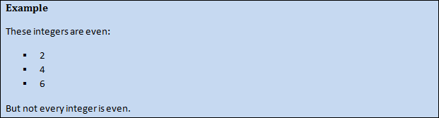
For example, it turns out not to be possible to include lists and tables inside boxes. The following is what you get if you try:
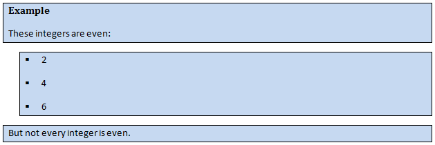
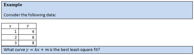
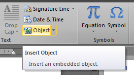
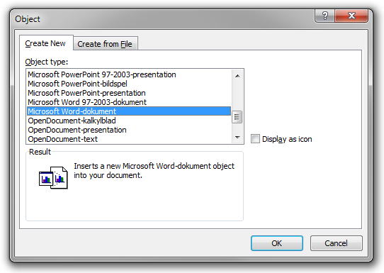
This is indeed a major limitation. Fortunately, there is a decent workaround. Simply insert a new Microsoft Word document as an OLE object.
Since OLE objects are inline objects, this will work. In addition, the object will be rendered as vector graphics and the background will be transparent, so the visual result will be perfect.
Using this approach, we produce the following examples:
Do I need to mention that this issue doesn’t exist at all in HTML? (In HTML, you can include any content you want in a DIV, like paragraphs, tables, lists, and other boxes.)
(A different solution is to use text boxes (a Microsoft Word feature) instead of normal paragraphs, but text boxes tend to be awkward to use in long documents, since they are tightly connected to direct formatting principles. In addition, a text box must be contained on a single page. Sure, you can link text boxes, but then you still need to know the exact number of boxes manually, and link them manually. Notice that even if the content of a box is fixed, the number of boxes required depends on where on the page the box starts.)
A box bug
One annoying ‘bug’ in Microsoft Word occasionally (but quite frequently) causes incorrect rendering of boxes containing mathematical formulae. Apparently, this happens when a box contains a page break, and the erroneous rendering is that the box is split into two parts immediately before the page break.
For example, the following rendering is unwanted.
It should look like this (image created using a bitmap image editor):
Unfortunately, I do not know exactly when this happens, nor do I know of any workaround. If you know anything about this, please send me a message.
Update (12/15/2014 7:59:14 PM): After some simple investigation, I believe the problem happens when the page break happens at a soft line break in a formula. See this DOCX example file. I know of no workaround.
Character styles
So far we have only talked about different types of text at the paragraph level (‘this paragraph is a heading, that one is a subheading’), but one can also talk about different types of text within paragraphs. For example, in written books, italics (a presentational attribute) is often used to indicate a number of different meanings (semantics, content): stress emphasis, a title of a work (e.g. a book), a defining instance of a term, an idiomatic phrase in a foreign language, a name of a ship, a taxonomic designation, a technical term, a word when you discuss the word itself, etc.
When it comes to such in-paragraph types of texts, it is again possible to apply presentational attributes (such as italics) directly. For instance, if you use an English-language version of Microsoft Word, Ctrl+I and Ctrl+B will toggle italics and boldface, respectively, at the caret (or to the selection). Or one can use styles to separate content and presentation.
Of course, the second approach is the preferred one in most cases (in theory). Indeed, if you want keywords in a textbook to be in bold orange text, you should create a style for this (named ‘Keyword’, perhaps?). This way
-
you do not need to repeat the same formatting commands every time you want to highlight a keyword,
-
all keywords are guaranteed to have the same formatting,
-
you can easily change the formatting of every keyword in the text at once,
-
and you can use a software program to create a list of all keywords in the text.
In the terminology of Microsoft Word, styles that apply to paragraphs are called ‘paragraph styles’ whereas styles that apply to spans of text within paragraphs are called ‘character styles’. The latter cannot contain any information about paragraph settings (like paragraph spacing or indentation). There is also a third kind of style: linked style. Those contain paragraph settings and may be used as paragraph styles, but may also be used as pure character styles by ignoring the paragraph settings.
In the following example, two definitions are marked up using a character style (named ‘Definition’, perhaps?). Three good-looking versions of presentational attributes connected to this style are given.


In addition, more specific (and visually complex) in-paragraph types of text, such as those related to computer code fragments, benefit greatly from the use of character styles. For example, you could create a character style named ‘Computer Code’ and give it a monospaced font and a greyish background:

Some padding would probably make this look better, but unfortunately Word does not support padding at the character level.
Although the general rule is to use styles and never apply formatting directly to the text, it is not unreasonable to make exceptions for some kinds of very simple character-level presentational attributes.
Indeed, in practice, you often do use direct formatting in the form of italics and boldface at the character level instead of using character styles. There are a few reasons for this:
-
It is somewhat awkward to set character styles the way Word is designed (compared to pressing Ctrl+I, say). Although it is possible to associate keyboard shortcuts to styles, the method of character style selection is not ideal for rapid typing. Indeed, in order to set the style to emphasis (say), you have to select the text that is to be emphasised, and then select the style. I believe you cannot simply write the text before the emphasis, ‘enter emphasis mode’, enter the emphasised text, ‘leave emphasis mode’, and continue with normal text.
-
Although it might make sense to restyle keywords and defining instances of terms (italic, bold, underline, background colour…?), in most cases the need to restyle in-paragraph text types is fairly small. For example, stress emphasis is almost always rendered in italics in books (and text in general). Also, setting this presentational attribute is very simple to do directly in the first place (press Ctrl+I).
-
More often than not, a Word document is printed or converted to PDF before it is distributed, and in these cases semantic annotation is lost anyway.
In conclusion:
-
Inside paragraphs, you use character styles to mark up special kinds of meaning, like emphases, defining instances of terms, titles of works, keywords, and pieces of computer code.
-
However, for the very simplest cases, like stress emphases that should be rendered in italics, you might simply choose to apply the presentational attributes directly. The reason is that the alternative (using a character style) is somewhat awkward and the gain of it fairly small.
Mathematics
Before Microsoft Word 2007, you had to use Microsoft Equation 3.0 that shipped with Word or some third-party formula editor to add formulae to documents; in any case, formulae were included as OLE objects because there was no native math support in Word.
However, Microsoft Word 2007 and later include an integrated formula editor, so that math can be edited as directly as ordinary text (formulae are no longer OLE objects). In addition, the new formula editor is vastly superior to the old Microsoft Equation 3.0 editor. In fact, it is completely brilliant when it works.
The new editor allows very convenient and rapid formula input using only the keyboard. It is very easy to include even rather advanced content (again, using only the keyboard) using a LaTeX-like notation with some additional shortcuts. Also, the WYSIWYG nature of Microsoft Word makes it much easier to navigate and maintain formulae in Word compared to plain LaTeX.
Here are some hints to get you started:
-
You insert a new formula by pressing Alt+=.
-
Special characters are inserted using the \chr syntax. Try \alpha, \Gamma, \cdot, \oplus, \partial, etc. (The token is replaced by the actual character when you press Space or when you you enter some suitable operator or punctuation after the code.)
-
In addition, you can try differently styled characters: \scriptD, \scriptO, \doubleR, \frakturR, etc.
-
a^b is automatically transformed to ab (when you press space or enter a binary operator, for instance). If your exponential contains several terms, write a^(b+c) which will be transformed to ab + c. If you really do want a(b + c), write a^((b+c)).
-
The same remarks apply to subscripts, like \epsilon_0.
-
The same remarks apply to fractions. 1/2 and 1/(a+b) will both be transformed to what you expect.
-
To insert a sin x, make sure to insert a space between a and sin. Otherwise the sin function will not be recognised, and thus it will be in italics (which is incorrect).
-
To modify a character, try v\bar, f\hat, x\dot, x\ddot, etc., followed by two spaces (the first one will replace the token, and the second one will format the structure).
-
To modify a group of terms, try (x+iy)\bar or \begin x+iy\end\bar and two spaces. (The parentheses in the first case will be removed.) However, the bar will hide the dot above the i, which is undesirable. Better is to use \overline(x+iy) followed by a space.
-
To write a n-ary sum, simply write \sum_(k=1)^\infty followed by a1 space to automatically get the sum symbol with k = 1 below and the infinity sign above. This also works with \prod, \int, \iint, \iiint, \oint, \oiint, \bigotimes, \bigcup, etc. (1 Actually, you need to press space twice. The first space will replace \infty by ∞ and the other one will set up the sum.)
-
To write a square root, write \sqrt followed by a space, or a parenthesised expression (and press space when you are done). To write the nth root of a, write \sqrt(n&a) followed by a space.
-
Binomial coefficients can be written (n\atop k).
-
Brackets of different kinds are automatically recognised in simple cases. For instance, you can write [a, b] and get a true bracket (after you press space or a binary operator, for instance). You can also try \bra \phi_1 | \phi_2 \ket and the vertical bar will be interpreted correctly as a separator.
-
You can also write ’strange’ brackets like [0, 1[ (which is how Swedes write [0, 1)), with only little more effort: [0, 1\right[ and a space.
-
To toggle bold/italic on/off, use Ctrl+B/Ctrl+I (this is Microsoft Word, remember?).
-
To insert a 3×3 matrix, write \matrix(@@&&) followed by a space. To get the parentheses, write (\matrix(@@&&)) and a space. You can also enter the elements directly (guess how!), but it is often easier to do that after the matrix ‘skeleton’ has been created.
-
You might find Shift+Return useful in some cases where you want to align formulae. Also, you have probably already realised that (x+4)^2 >= 0, \forall x\in\doubleR looks very good on its own row if you put two spaces after the comma!
-
To enter plain text in a formula, write the text inside double quotation marks: For instance, a =\above("by the lemma") 0 and E_"before"; end by pressing space once or twice (or enter a binary operator or something else you need).
As examplified above, Word automatically replaces tokens (such as \int) when you press Space or some suitable operator or punctuation mark, and automatically formats structures like fractions, superscripts, large operators and brackets when you press Space or enter some suitable operator or punctuation mark. In the sequel, I will not explicitly point out the need to trigger these actions. For example, I will write ‘enter a^b’ instead of ‘enter a^b followed by a space, a binary operator, or some suitable punctuation’.
Finally, do not forget the context (right-click) menu. This is highly context sensitive, and has a lot of convenient commands (set degree of root, remove accent, add lower/upper limit, remove limit, remove exponent, add argument, remove brackets, etc.). If you have a Menu key on your keyboard, this will come in very handy (you should also learn the letter that activates each menu item). If you do not have a menu key on your keyboard, consider buying a new keyboard with such a key.
Math AutoCorrect
The formula editor in Microsoft Word 2007 and later is great out of the box, but some manual tuning can make it suit your personal needs better.
To change math settings, you click the small button in the bottom-right corner of the Tools group in the Design (Equation Tools) tab of the ribbon to bring up the Equation Options dialog box.
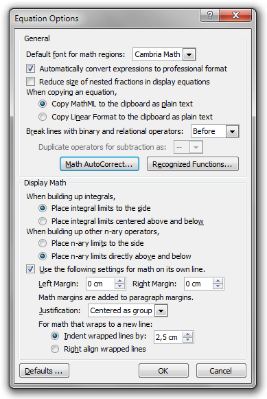
Personally, I have changed the operator line-break option so that binary and relational operators are duplicated, but your mileage may vary. By clicking the ‘Recognized Functions…’ button, you can add identifiers that you want Word to recognise as functions (like sin). The ‘Math AutoCorrect…’ button opens the following dialog box.
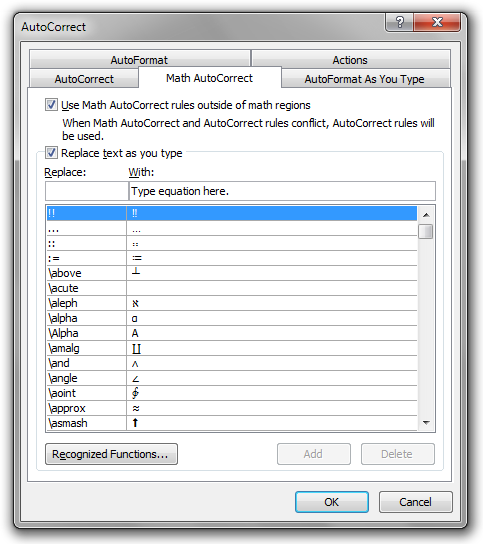
Here you can add, change, and delete the tokens that Word will automatically replace, like \int which is replaced by ∫. You should make this dialog box your friend.
First, it requires super-human patience to write \doubleR, \doubleC etc. every time you need the symbols ℝ, ℂ etc. To remedy this, you should add \R, \C etc. to the list:
- \N
- ℕ
- \Z
- ℤ
- \Q
- ℚ
- \R
- ℝ
- \C
- ℂ
Also, I find it very convenient to enable the ‘Use Math AutoCorrect rules outside of math regions’ option. This way, the mathematical list of tokens to be automatically replaced will be used everywhere in Word, and not only inside formulae.
Moving on, Math AutoCorrect can be used to enter fancy arrows. The following is a screenshot from one of my math texts:

How did I achieve these long arrows? The answer is that I have put (literal) whitespace above the arrows; they will stretch to match the length of the text above. Also, I surround the arrows with (literal) whitespace to create the spacing. (Yes, this is semantically nonsensical, but this is Word. It works perfect in practice, and there is not really any better solution.)
In detail, I use the following text to create the arrows:
" " ⇔┴" " " "
The ┴ character comes from \above. I use Math AutoCorrect to insert the above string in response to the token \cooleq. Similarly, I use \coolimp to insert an implication arrow. To summarise,
- \cooleq
-
" " ⇔┴" " " " - \coolimp
-
" " ⇒┴" " " "
This way, I only have to write \cooleq (say) and press Space twice in order to obtain the nice arrow. (Exercise: Why twice?)
In the screenshot, I also use curly brackets to enclose systems of equations (the semantics is that the individual lines within a bracket are to be combined via the logical ∧ operator). The same notational device is used when defining functions piecewise. To create these brackets conveniently, I have added the following Math AutoCorrect item:
- \pw
-
{┤
┤ is inserted by \close; it closes the bracket. {┤ and a space will create an empty bracket list, to be filled-in in WYSIWYG mode. This is probably the easiest way, but you can also write the entire structure manually at once, like in {\eqarray(a@b@c)\close.
Equation numbering
Neither the old Microsoft Equation 3.0 editor nor the new integrated formula editor offers automatic equation numbering. It is a bit sad that the new editor – which is really well-designed otherwise – cannot do this, because equation numbering is very important in most math-heavy texts.
However, in the old days, you could easily number Microsoft Equation 3.0 objects manually. The approach was to create a centred tab stop at the middle of the page (often at 8 cm) and a right-aligned tab stop at the right margin (often at 16 cm). Then you simply put the formula at the first tab stop and the equation number at the second tab stop, producing results like this:
This is extremely robust and the visual appearance is perfect (if you disregard the fact that the old equation editor was very limited in functionality and didn’t produce very pretty results at all).
Now we get to the bad news. If you use the new formula editor, this approach does not work anymore. In fact, there is no reasonably simple way to number equations (not even manually). Why is this? To understand the problem, we must digress a bit.
Formulae created by the new editor can be displayed in two modes. First, there is the ‘standard’ mode which is used if the formula is alone on its line (alone in a paragraph in the technical sense, or alone on a line created using one or two soft line breaks within a paragraph). This mode is also called ‘display’ mode. But then there is also a special ‘inline’ mode, used if the formula is included together with other (normal, non-math) text in a line. In this mode, the formula is automatically typeset in a more compact way, as illustrated in the following two examples:
This is not a bug, but a great feature. Indeed, in math-heavy texts, formulae are used both ways. Large and central formulae are put in their own paragraphs (visually), while smaller formulae are included within ordinary paragraphs without this visual emphasis. And in the latter case, you do want the formula to be a nice citizen within the paragraph. In the example above, the different typesetting is fairly obvious. However, in practice, in-line formulae are most often smaller than the one above. A typical example might be the following:

Still, occasionally you do ‘need’ to include larger formulae together with ordinary text within a paragraph, and so Word’s automatic reduction of format is very helpful, indeed.
Let us return to the question of equation numbering. Now we know why the old-school approach of manual equation numbering does no longer work. If you try to number a formula this way, you insert two horizontal tab characters and the equation number within the same paragraph as the formula, so Word will (incorrectly) assume the formula is used ‘in-line’ and display it as such. Hence, the formula will be displayed in the ‘compact’ way, even though it is effectively used alone in its paragraph. The result is this:

Notice that the integral sign is too compact. (An even more severe catastrophe will result if you do this to a sum or to 1/(1/a+1/b).)
This is all very sad. The new formula editor in Microsoft Word 2007 and later is awesome, but it clearly lacks a very important feature. It is almost like designing a really luxurious car, and forgetting to add doors to it. Fortunately, there is a way to number equations manually (using the modern editor), but it is certainly not convenient. Rather, it is horrible, but the end result (which you get to after quite some effort) looks perfect.
The trick is to create a 1×3 table and put the formula in the middle cell and the equation number in the right-most cell. This way the formula becomes alone in its paragraph, but the visual result is as if you used the tab stop method. To do this, follow these steps:
-
Create a 1×3 table.
-
Set the width of the table to 100 % (using the Table Properties dialog box).
-
Set the column widths of the table to 10 %, 80 %, and 10 %, respectively (using the Table Properties dialog box).
-
Set the alignment of the middle cell to ‘Align Center’ (using the Alignment group in the Layout Table Tools tab of the ribbon).
-
Set the alignment of the rightmost cell to ‘Align Center Right’ (using the Alignment group in the Layout Table Tools tab of the ribbon).
-
Disable the table border (using the Borders button in the Table Styles group in the Design Table Tools tab of the ribbon).
-
Select the entire table and set the ‘Space After’ paragraph setting to 10 pt, or whatever is used for normal body text in the document (using the Paragraph group in the Page Layout tab of the ribbon).
-
Put the formula in the middle cell and the equation number in the right-most cell. (Well, obviously...)
The following is what you get:
If you skipped Step 7, the space between the formula and the line after would be too small (well, none, actually). If you enable the display of hidden formatting characters and table gridlines, you see more clearly the structure of this construction:
Math limitations and bugs
So far, I have almost exclusively praised the new formula editor in Microsoft Word (the lack of a convenient method for equation numbering being the sole exception). In this section, however, I will point out the problems related to the editor.
One of the problems that bother me the most is related to formatting. I want my vectors (in classical contexts) in regular bold (in particular, I do not want them in bold italics!). Hence, to format a vector, I press Ctrl+B and Ctrl+I to enable boldface and disable italics, respectively. This works. But: sometimes (regularly and rather often) when I open a Microsoft Word document, I find that the vectors I added the last session are now in bold italics (even though I am certain they were in regular bold when I last saved the document)! Hence, I need to select those and disable italics (again). But after this they will (usually) remain regular bold, so I need to reapply the formatting only once. Of course, this is very annoying. It has happened several times that I have sent out or published documents with incorrect vector formatting (bold italics) at some place(s), because I haven’t spotted the problem in time. So, formatting in Word formulae is not quite WYSIWYG, but rather WYSIWYPG.
-
When I save the document:

-
When I open the document the next time:
Another annoying behaviour is that you cannot control the appearance of formulae in headings, figure captions etc. For example, if you enter a formula in a heading, you get something like this:
This is not good, because scalar quantities should not be bold. Hence, you should change to regular font:
The problem is that this manual override will not last. Save and open the document twice or so, and you get the (unwanted) boldface back. As far as I know, you simply cannot win this battle.
A third annoying limitation is that things like mathematic superscripts do not display properly in TOCs, as we saw earlier.
The previous issues are about formatting. But sometimes Word has been messing with the contents of my formulae as well. For example, it has happened quite a few times that Word has simply removed single characters from my formulae! That is really bad. However, I believe this only happens when you insert consecutive spaces manually in formulae (in order to override the automatic spacing rules), which is bad practice anyway. So now you have really good reason not to do this!
The first bug I found in the new formula editor was way back in 2007. I realised that Word would refuse to save documents after you insert a formula inside a list item containing soft line breaks. Since I regularly use the save function, I stopped doing this. But now that I try to reproduce the bug in Word 2010, I seem not able to do that. Maybe this bug has been fixed.
There are also problems related to performance and stability.
For example, the new formula editor becomes very slow in large formulae. I regularly create formulae the size of a half A4 page (or larger), and then I have to wait several seconds before something happens on-screen after I insert a character into the formula.
Also, formulae tend to corrupt Word documents. It has happened to me several times that Word crash when I try to insert a particular character at a particular position inside a formula. (And more often than not, this is a character that I really need to insert at that position.) The only solution is to recreate the formula from scratch.
References
Heading numbering
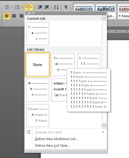
In Microsoft Word it is very easy to let the software number your headings automatically. I always use heading numbering in articles and books, and one particular example was given earlier.
To setup heading numbering, put the caret somewhere inside the first Heading 1 of your document and select one of the heading numbering styles from the List Library in the popup menu of the Multilevel List button in the Paragraph group on the Home tab of the ribbon.
This will transform
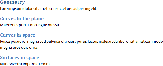
into
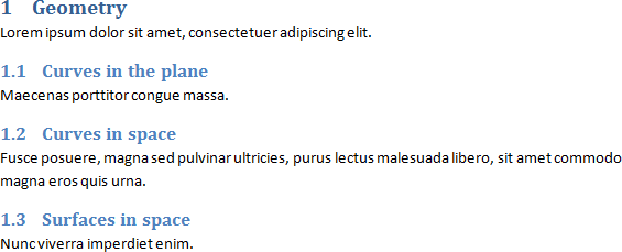
The numbering is really automatic (of course), so if you add a heading somewhere in the middle of the document, the numbering of the succeeding headings in the document will be updated automatically.
Although this works very well in simple cases, there are limitations. For example, there is no natural way to use different numbering styles in different parts of the text. In particular, there is no natural way to use a different numbering style for the appendices. However, there is an unnatural way of accomplishing this, as detailed on page 17 of my report [1].
Cross-references
If you want to refer to some part of the text, you should use dynamic cross-references. For example, you might want to refer to some particular section, as in ‘In Section 2.3, we discovered that…’. In this case, you press the Cross-reference button in the Captions group in the References tab of the ribbon. In the dialog box that is opened, you then select the heading of the section you want to refer to, and the kind of reference text you want to include (such as the full heading text, only the heading number, or the page of the heading).
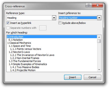
Of course, if you rearrange the document so that the page, number, or text of the heading changes, the cross-reference text will be updated automatically.
You can also make references to other objects in the document, in addition to headings. For example, if you use Word’s ability to create numbered figure and table captions, you can refer to (captioned) figures and tables. To insert a numbered caption for a figure or a table, simply right-click the object and select ‘Insert Caption…’. The following example is the caption of the first figure in one of my physics texts.
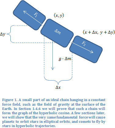
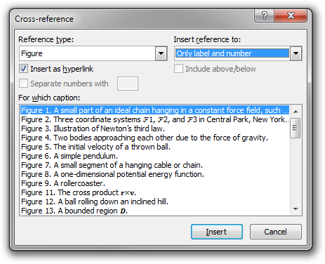
(Notice that the figure caption itself contains an automatic cross-reference to a section (technically, to a heading) of the text.) If I would insert a new captioned figure into the text before this one, the number of this figure would increase to 2 automatically. To insert a reference to a captioned figure, simply select Figure in the Cross-reference dialog box:
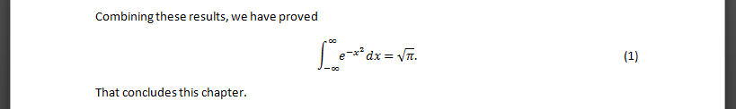
Automatic numbering of equations
In a previous section, we noticed that Microsoft Word has no built-in automatic way of numbering equations. Indeed, it is not even typographically possible to put any text next to a display equation! In that section, I described the standard workaround which enables you to produce the same visual appearance as if a display equation is on the same line as some other text. Using that technique, you can manually number your equations.
However, it takes quite some time to setup the construction, and the numbering is still manual, and there is no way to make cross-references to the equation. In this section, we will solve all three of these problems.
Problem 1. First, is there a simpler way to insert the 1×3 table in the construction? Of course, you could use copy-paste, but there is a more convenient way using ‘Building Blocks’. To set this up, create the construction once and for all, using an empty formula and a placeholder number (following the seven steps of the previous section) and select the entire table.

Then press Alt+F3 to create a new ‘Building Block’ from the selection.
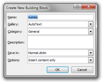
Give the Building Block the name numeq (say) and press OK.
Now you only have to type numeq followed by F3 (on an empty paragraph) to insert the entire table construction at the caret, after which you only need to enter your equation and its number. You never have to follow the seven steps again!
Warning! You may also press Enter instead of F3 if Word suggests this. If I do this, it works fine, but when I insert the first character of the paragraph after the equation, Word automatically inserts a space character before the desired character. For example, if I press W, Word inserts w, that is, a space character followed by ‘w’. You must manually remove this unwanted space character. Or stick to F3.
Problem 2. Still, we do the actual numbering manually, which – of course – gets extremely difficulty in long documents (unless you never revise sections you have already written). Fortunately, it is possible to let Word number equations automatically, like headings and figure and table captions.
There are two fundamentally different approaches. The first is to use multi-level lists, like we did for headings. However, for a number of reasons, I do not like that approach. For one thing, I do not believe the method is robust and it is also very difficult (if not impossible) to extend to theorem numbering (as we will describe in the next section).
Instead, I will use a method based on fields and bookmarks (more like figure and table captions). Indeed, Word has a SEQ field which can be used to create sequences of numbered items in the text. To implement this, we need to redo the construction in the building block. So, insert the standard 1×3 table template, as before. But this time we insert a SEQ field in the right-most column. To do this, put the caret in the empty cell and insert brackets (). Now, place the caret between these and press Ctrl+F9. Then write SEQ Equation and press F9. Then select the table and save it as a building block as before (you may overwrite the ‘numeq’ template).
Now you have automatic equation numbering! When you insert the building block (by typing numeq followed by F3 on a new line), you get a new display equation with an automatic number to the right. This number will be updated automatically by Word. For instance, if you insert a new equation before the fifth one, it will become the sixth one.
Well, actually, fields are not updated really ‘automatically’, but almost. They are updated (for example) when you print the document, and you can always update a particular field manually by pressing F9 when the caret is inside it. To update all the fields in the document at once, select the entire text (using Ctrl+A) and press F9.
You can even make Word restart the numbering at the beginning of each new chapter (Heading 1) by using the field SEQ Equation \s 1 instead. More generally, the \s N option tells Word to restart numbering after each Heading N.
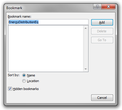
Problem 3. So, is there a way to make automatic cross-references to equations? Yes, there is! To allow cross-references to some particular equation, you must give it a bookmark. Although Word can do this automatically, you might want to do it manually, so you can give it a more descriptive name. To do this, select the equation number (not including the parentheses) and press the Bookmark button in the Links group in the Insert tab of the ribbon. Give the equation a document-unique descriptive name and press Add.
Now you can create cross-references to the equation using the ordinary cross-reference window.
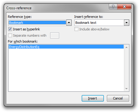
If you choose ‘Bookmark text’ as the reference, the equation number will be displayed, but you can also choose the page number, as usual. Of course, the cross-references will be updated ‘automatically’ if the equation number changes, or if it will end up on a new page.
This is awesome!
Automatic numbering of definitions and theorems
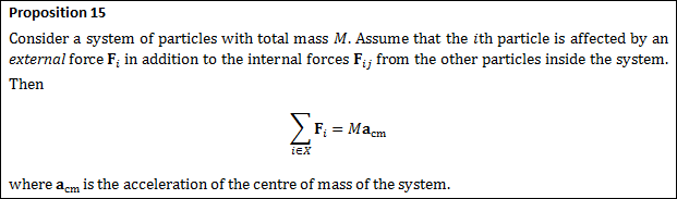
In mathematics and mathematical physics texts it is common practice to number definitions and theorems. A typical example is given below.
In some texts, definitions and theorems share a single sequence of numbers, and sometimes each type of object has its own sequence.
Now, in Microsoft Word, is there some way to number objects like this automatically, and to create dynamic cross-references to them? Yes, there is, and we already know how to do it using the SEQ field and bookmarks.
If you want to use a single sequence to number all kinds of objects (both definitions and theorems), you could use a single sequence named ‘Box’, for example. If you want two separate sequences for definitions and theorems, you could use two sequences named ‘Definition’ and ‘Theorem’, respectively. In the sequel, we will use only a single sequence.
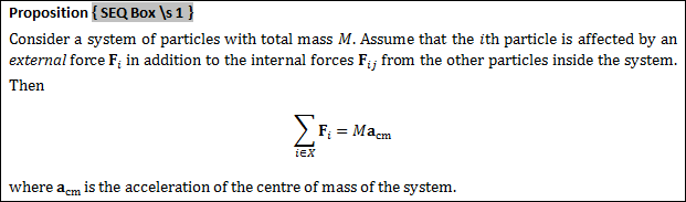
To number a particular object, simply press Ctrl+F9 where you want the number, and enter SEQ Box or SEQ Box \s 1 (or whatever suits you). The latter version will restart the numbering at each chapter heading (‘Heading 1’). Then press F9 to update the field.
If you want a convenient and robust way of referring to the box (definition or theorem), you should assign it a descriptive bookmark name, as we did for equations in the previous section: select the number of the box, and click Insert/Bookmark in the ribbon. Then you can create cross-references to the box, using that friendly bookmark name.
In the example above, I think I would use ‘NewtonSecondDiscreteSystem’ as the bookmark name. To make a reference to this bookmark, you can use the GUI as described in the previous section, or you could press Ctrl+F9, type REF NewtonSecondDiscreteSystem \h and press F9.

You can also include the page number of the bookmark, using the PageRef field:

This might look like

To simplify the creation of numbered boxes further, you could create a ‘building block’ with the SEQ field, or even with the entire box skeleton (which includes the field).
Reference shortcuts
In the last three sections, we made heavy use of bookmarks and cross-references. Since cross-references are common in technical documents, the reader will be happy to learn that you can create bookmarks and insert cross-references using keyboard shortcuts.
To open the Bookmark dialog box, which we previously accessed via Insert/Bookmark, you can press Shift+Ctrl+F5.
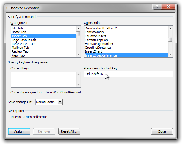
Turning to the Cross-reference window (which is not modal), there is no default shortcut to it. However, I suggest you assign Shift+Ctrl+R to it. To do this, simply click File, Options, Customize Ribbon and then ‘Customize…’ next to ‘Keyboard shortcuts’. Select the ‘Insert Tab’ category and the ‘InsertCrossReference’ command. Put keyboard focus in the edit field below the ‘Press new shortcut key:’ label, and press the shortcut. Finally, press ‘Assign’.
While still discussing convenient keyboard shortcuts, you should make sure you know about Ctrl+Alt+F which inserts a footnote.
Graphics
Introduction to bitmapped (raster) graphics
You often want to include images in Microsoft Word documents. Very often, images are bitmapped (or raster graphics images), that is, they are represented in the computer as a two-dimensional grid of pixels (of various colour). For example, a typical modern digital camera might produce bitmapped images sized 4752×3168, and a screenshot of a computer display may be of size 1920×1080. There are many digital file formats that can be used to store bitmapped images, the most common being BMP, JPEG, GIF, PNG, and TIFF.
BMP is an old file format introduced in early versions of Microsoft Windows. There is (typically) no compression, so files are very large. A BMP file of size 4752×3168 with a normal colour depth of 24 bits per pixels (that is, 3 bytes per pixel, or one byte per RGB channel and pixel, so e.g. the red component of a pixel is a number between 0 and 255) will be larger than 43 megabytes (almost all of this being due to the actual pixel data, but BMP files also contain a small file header).
A much better choice for photographs is the JPEG file format. This format is specifically designed to store photographic images. It uses advanced mathematical techniques to compress the image data. The compression is lossy, meaning that information is permanently lost during compression. However, the format is designed so that the loss of visual quality of a typical photographic image is barely noticeable to a human viewer. At the same time, the file size is greatly reduced. In the above example, the BMP file had a file size of 43 megabytes. The same photograph, saved in the JPEG file format with a small level of lossy compression, will only be 6 MB. And the loss of quality is (almost) invisible to a human viewer.
Warning! As mentioned above, the JPEG file format is specifically designed so that the loss in image quality will be almost invisible to the human eye in photographic images. However, the loss of quality will be very visible in non-photographic images! For example, it is a terrible idea to save diagrams, computer screenshots, and images containing (computer) text in the JPEG format, since precise thin lines and solid-colour regions will be very visibly distorted by the compression. Again: JPEG compression is only suitable for photographic bitmapped images!
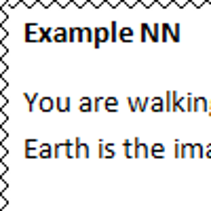
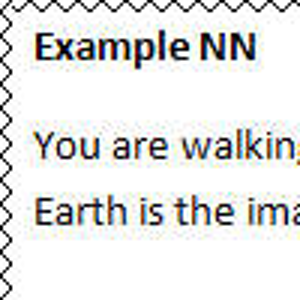
In the following example, a screenshot of a Microsoft Word document is displayed without lossy compression (the first image), and (incorrectly) with JPEG compression (the second image). Notice how horrible the second image looks!
If you have subpar vision or a bad computer display, the difference might not be as obvious as it would be otherwise. But you probably can see the difference in the following magnifications (uncompressed and JPEG compressed):
So, should you use BMP instead of JPEG when it comes to bitmapped images containing non-photographic data such as diagrams and screenshots? No, instead you should use the PNG file format.
The PNG file format is a modern file format used to represent bitmapped images. It is compressed, but the compression is lossless, meaning that no information is lost during compression. Hence, there is never any loss of quality (or even any change to the image data at all) during compression and decompression. Hence, PNG is perfect to use for non-photographic images such as diagrams and screenshots, and, more generally, images containing areas of solid colour, precise discrete curves, and text.
For example, the previous example image (containing a part of a Microsoft Word document) has dimensions 672×240, so if saved as a 24 bpp BMP file, it would require more than 440 kB of data. On the other hand, if saved as a PNG image, it will only require about 9 kB. And there is absolutely no loss of quality.
What about GIF? Well, GIF is generally an obsolete format. Like the PNG format, it employs lossless compression, so it is suitable for the same type of graphics as the PNG file format. However, a single bitmap frame inside a GIF image can only contain 256 distinct colours, which is a severe restriction. But to compensate, a GIF image may contain several different frames, which makes it technically possible to represent full-colour images (although it is awkward). Unlike PNG images, GIF images can be animated (different frames are rendered in succession in time), so GIF images are still used for simple animations on the Internet. But for all other applications, PNG is a much better choice.
Finally, the TIFF file format is a rather advanced file format used in various software products to represent high-quality images, with or without lossy compression.
In conclusion, so far:
- For photographic images, use the JPEG file format (with not too severe compression).
- For most non-photographic images, such as diagrams and screenshots (and, more generally, any images containing precise thin lines and precise solid-colour regions), do not use the JPEG file format. Instead, use PNG.
Introduction to vector graphics
When it comes to some kinds of (fundamentally non-photographic) images, such as illustrations and diagrams, it is possible to represent them in a more semantic way than as a grid of pixels.
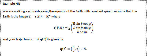
For example, a few days ago I created the following image:

Of course, it is possible to represent this as a grid of pixels. But there is also a completely different way to represent this image in a computer. Instead of representing it as a raster graphics image, that is, using an array of pixels, one can describe it as a collection of geometric primitives. That is, it is stored in the computer as a set of (coordinates for) lines, rectangles, and other paths, with associated formatting instructions. Such an image is called a vector graphics image, as opposed to a bitmapped (or raster graphics) image.
In fact, this is how I made the image above. I used an ordinary text editor to write the image by hand, using the SVG language:
<?xml version="1.0" encoding="UTF-8" standalone="no"?>
<!DOCTYPE svg PUBLIC "-//W3C//DTD SVG 1.1//EN"
"https://www.w3.org/Graphics/SVG/1.1/DTD/svg11.dtd">
<svg xmlns="https://www.w3.org/2000/svg" version="1.1" width="22px" height="24px">
  <defs>
    <style type="text/css"><![CDATA[
      #menu, #cursor, .menuitem {
        fill: white;
        stroke: black;
      }
      #selection {
        fill: black;
      }
      .menuitem.selected {
        stroke: white;
      }
    ]]></style>
  </defs>
  <title>The menu key</title>
  <desc>The 'menu' key on a standard PC keyboard:
    a popup menu consisting of four menu items and a cursor hovering above the second one.</desc>
  <!-- Menu border -->
  <rect id="menu" x="1" y="1" width="18" height="22" />
  <!-- Selection -->
  <rect id="selection" x="1" y="7.6" width="18" height="4.4" />
  <!-- Menu items -->
  <line class="menuitem" x1="4" x2="16" y1="5.4" y2="5.4" />
  <line class="menuitem selected" x1="4" x2="16" y1="9.8" y2="9.8" />
  <line class="menuitem" x1="4" x2="16" y1="14.2" y2="14.2" />
  <line class="menuitem" x1="4" x2="16" y1="18.6" y2="18.6" />
  <!-- Cursor -->
  <g transform="translate(14 9.8) rotate(-30)">
    <path id="cursor" d="M 0 0 L 3.5 7.5 L 1.25 7.5 L 1.25 12 L -1.25 12 L -1.25 7.5 L -3.5 7.5 z" />
  </g>
</svg>
Whenever possible, you should use vector graphics instead of bitmapped graphics. There are many advantages to this:
- The file size is much smaller. The above text is only 1.2 kB (ASCII or UTF-8). This should be compared to the 5 kB required if you save the above image (at the size above) as a PNG image.
- You can magnify and scale the image any way you like (such as making it 100 times larger), and there will never be any pixellation. It will always look perfectly crisp.
- It is very easy to change the image after it has been created. Instead of manipulating each ‘pixel’ manually, you can simply change the geometric primitives and their presentational attributes.
Let us illustrate the second point by considering the following image. It is a smaller version of the popup menu icon:

If the icon is magnified, the left image below shows the result if the icon is a bitmap image; the right image shows the result if the icon is a vector image.
 magnified as a bitmap image (left) and as a vector image (right).
Exercise in logical thinking and clear communication: Explain exactly why, as clearly as possible, you get these two very different results.
There are even more benefits of using vector graphics. If you display a raster image on a computer display that has higher resolution than the image was designed for, and you do not want the image to become smaller (you generally don’t), the image is effectively magnified, so it will look pixellated compared to the rest of the document. The same thing happens if you print an image, since printers generally have much higher resolution compared to standard computer monitors.
Unfortunately, Microsoft Word does not support the SVG file format, which is very sad, because the format is absolutely brilliant, and it is the format the rest of the world is using.
However, Microsoft Word does support the Windows Metafile (WMF) and Enhanced Metafile (EMF) formats. These are old (and to some extent obsolete) vector graphics file formats native to the Microsoft Windows platform. They are not editable using text editors, and they are not used much (read: at all) on the Internet or by contemporary third-party software, but they are still vector graphics.
Hence, if you want to include external images in a Microsoft Word document, and it is feasible to represent them as vector graphics (this excludes photographs but includes most types of diagrams and illustrations), you should make sure to use a vector WMF or EMF file.
This way the images will look perfect when scaled and printed; otherwise, they will look pixellated.
Personally, I always use my own mathematical software AlgoSim to create images for my mathematics and physics texts. I always save 2D illustrations (except for heatmaps) as Windows Metafiles. Here are a couple of simple examples from my text about multivariable calculus (represented as SVG files in this hypertext document).


In conclusion, so far:
- If an image can reasonably be represented as a vector image, use the WMF or EMF file format.
- Otherwise, for illustrations, diagrams, screenshots, and most other types of non-photographic images, use the PNG file format.
- For photographic images, use the JPG format (with not too much compression).
Word vector graphics
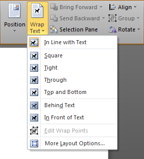
In addition to embedding external image files into Word documents, it is possible to create illustrations directly in Microsoft Word using the built-in vector graphics editing capabilities. To create a new drawing in a Microsoft Word document, select Insert/Shapes and choose a geometric shape or ‘New Drawing Canvas’. Generally, it is best to create a canvas, which is simply a rectangular region in which you can place an arbitrary number of geometric shapes; this way, you can manipulate the entire illustration as a single unit. However, it is also possible to insert geometric shapes directly into the document, without using any canvas. This can only be recommended for very simple illustrations (such as those consisting of a single shape). When a graphics object is selected, the Format Drawing Tools contextual ribbon tab is shown.
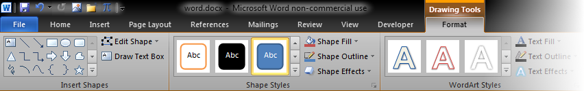
A canvas, or a shape inserted directly into the document, can be ‘attached’ to the main text in several different ways, which you choose using the ‘Wrap Text’ commands. One way, which is often the most robust one, is to let the object be an in-line object, so that it flows with the text like any in-line character. This option is called ‘In Line with Text’ in Word 2010.
But it is also possible to have the object move freely across the pages. In this case, there are several ways the normal text can respond to the object. It is possible that the text does not reflow at all; in this case, either the text is rendered above the object (the object is ‘Behind Text’), or the object is rendered above the text (it is ‘In Front of Text’). But in general it is probably better to have the text reflow in order to avoid the object. You can adjust very precisely how the text should do this. For example, you can have the text avoid the entire vertical span of the object (the ‘Top and Bottom’ setting), you can have the text avoid a rectangular region containing the object (the ‘Square’ setting), or you can have the text avoid only the actual object (which might be non-rectangular). In the last case (the ‘Tight’ setting), you can even adjust the ‘wrap boundary’ completely independently of the actual shape of the object.
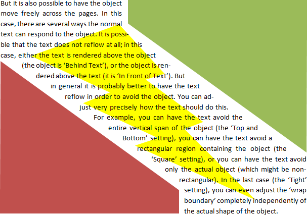
Actually, Microsoft Word is a rather decent vector graphics editor. It is powerful enough that many illustrations can be created directly in Microsoft Word, but it is also unpolished enough that it can be a tedious experience to work with it.
Below are just a small number of the illustrations I have created in Microsoft Word for use in my texts the last years.
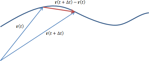
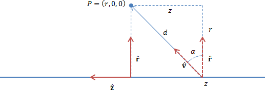
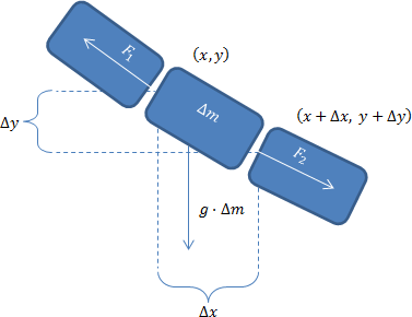
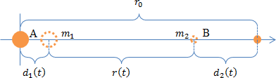
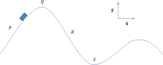
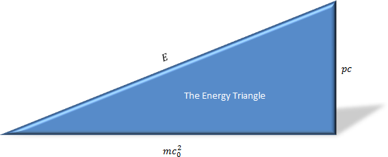
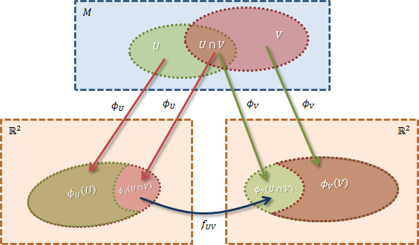
Creating Word vector graphics
Let us give a few tips on how to work with vector graphics in Word:
-
In most illustrations, you use many different objects (shapes, text boxes, …). It is a very good idea to put such an illustration in a drawing canvas, so you get a single container to worry about in relation to the rest of the document.
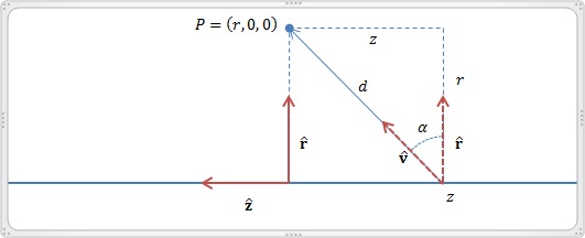
-
In the last section, we saw the shape and formatting part of the Format Drawing Tools tab of the ribbon. But equally important is the arrange and size part:
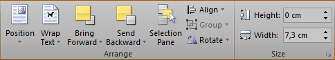
-
Know your modifiers
-
When you draw a line [using the mouse], you can hold down the Shift key to fix the angle to integer multiples of 45° relative to the screen’s coordinate axes.
-
When you move a line, the Shift key forces a translation along either the horizontal or the vertical axis.
-
When you drag an endpoint of a line, the Shift key fixes the direction of the line.
-
When you draw a 2D shape (e.g., a rectangle or an ellipse), the Shift key preserves its natural aspect ratio (e.g., makes it square or a circle, respectively). The Ctrl key puts the ‘anchor’ point at the centre instead of at the opposite corner.
-
If you drag the handle at one of the four corners of a 2D shape, the Shift key will force uniform scaling, preserving the aspect ratio of the shape. The Ctrl key puts the ‘anchor’ point at the centre instead of at the opposite corner. (This modifier also works if you drag a handle that is not at one of the four corners.)
-
All ‘mouse dragging operations’ (with two small exceptions) try to snap objects to an invisible grid. To move freely, hold down the Alt key.
-
For example, if you have a complicated 2D shape and select its upper-right corner handle, while all three modifiers are depressed, you will scale the shape uniformly (preserving its aspect ratio), smoothly (not sticking the size of the shape to a discrete set of values), and with the centre of the figure fixed during the operation.
-
When an object is selected, you can move it with the arrow keys. The Shift modifier will resize the object vertically or horizontally instead of moving it; the Alt modifier, when used with the right and left arrow keys, will rotate. In all three cases, the Ctrl modifier will do the operation smoothly.
-
-
The circular green handle of a 2D object is used for rotation. Rotation is smooth by default, but the Shift key can make it discrete; the step size appears to be 15°.
-
A yellow square standing on one of its corners is used to alter a parameter of a ‘complex’ built-in shape.
-
If you want a number of equal-length lines (such as arrows), you can create one and simply copy-paste it.
-
You can also set the lengths of lines (and, more generally, the dimensions of objects) using the Height and Width fields in the ribbon. To get more precise control, you can right-click an object and select ‘More Layout Options’. Here you can enter not only the width and height of the object, but also any angle of rotation in degrees. This is very useful. Notice that rotation is clockwise (which is very strange, but still…).
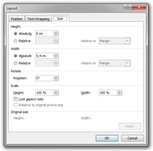
Warning! It is not possible to enter a negative angle, so if you want to rotate 10° anti-clockwise, you cannot enter a value of −10°. Instead, you have to enter 350°. (To me it appears as if a negative value will result in undefined behaviour…)
-
You can right-click a shape and select ‘Edit Points’ to edit the precise path which the shape is based on. Don’t forget to right-click nodes and edges.
-
In complex illustrations, it is often convenient to group related shapes into collections. If the related shapes are all selected, you can probably use the keyboard command Menu, G, G to do this quickly. (This might not work in your language version of Microsoft Word.)
-
The Align commands are very useful.
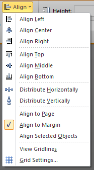
Warning! These commands are strangely disabled if you work inside a drawing canvas (as you should do if you work with many different objects!). Hence, every time I want to create a complicated illustration, I create it directly on the text canvas (that is, not on a drawing canvas) of a new, empty, Microsoft Word document. When I am done, I select the entire illustration (that is, I select all the objects that make up the illustration), and copy it to a drawing canvas in the actual document I am working on. This way I do get the illustration inside a drawing canvas, but I can still use the align commands while creating the illustration.
-
Connecting shapes by curves that will follow the shapes automatically as they are moved is a fragile feature that seems only to be enabled within a drawing canvas.
-
An illustration may contain text boxes that may contain formulae. If you use text boxes to annotate objects in an illustration, you probably want to set ‘Shape Fill’ and ‘Shape Outline’ to ‘No Fill’ and ‘No Outline’, respectively.
-
To select an object that is obscured by text or by other objects (that might be semi-transparent), you can use the Selection Pane.
-
You must be smart, creative, and patient when you create complex Word vector illustrations. Much is possible, but you may have to use ‘tricks’ to get there.
A visually impressive word processor
For a long time, Microsoft Word has had very impressive graphics features. Already in Word 97 it was possible to add very fancy WordArt and add impressive styling to text boxes and shapes. And in Microsoft Word 2007 (if I recall correctly), the graphics features were redone, and they are now more impressive than ever. The following is a (silly) example I made to illustrate the possibilities.
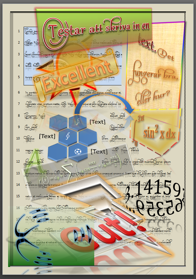
All of the graphical objects are simple Word vector graphics objects (shapes and text boxes), and they have been styled using the commands in the ribbon (and the new Format Shape dialog box).
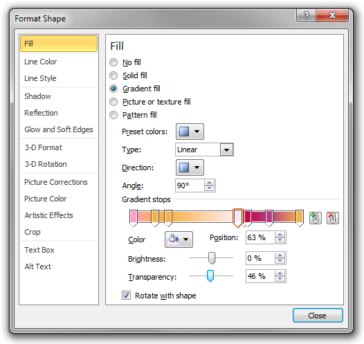
The text is normal text, even though it looks surprisingly decorated. I used the Gabriola font and chose one of the non-standard ‘Stylistic sets’ under ‘OpenType Features’ in the font dialog box.
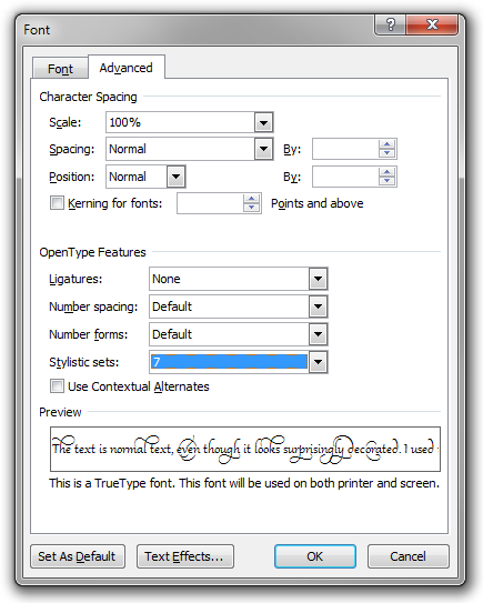
Finally, the set of hexagons in the middle of the page is an example of SmartArt, a new and extremely easy-to-use (and visually impressive) way to make simple diagrams in Microsoft Word.
Admittedly, in the types of text I usually write (mathematics and physics articles and books), I almost never use any fancy shape formatting or SmartArt at all. But I still wanted to show what is possible, and – of course – there are other types of documents you can create in Word.
Miscellaneous Word tips
In this section, I give small miscellaneous tips about using Microsoft Word. This list is by no means complete. In particular, I do not repeat things I have covered in previous sections.
Very basic editing
-
Of course, the reader is very familiar with the (extended) keyboard shortcuts used to navigate text on the Microsoft Windows platform. But still, here is a summary: The arrow keys move the caret one character or line at a time. Using the Ctrl modifier key, you move a word (horizontally) or a paragraph (vertically) at a time instead. The Shift modifier key extends the selection. (And, of course, Ctrl and Shift can be combined.) Home and End move to the beginning and end of the line, respectively. With Ctrl, they go to the beginning and the end of the document, respectively. Shift extends the selection. PgUp and PgDn move a screen up or down, and with Ctrl they by default move a page up or down. Backspace and Delete remove the preceding and next character, respectively. With the Ctrl modifier, the entire preceding or next word is removed.
-
You probably also know these very basic keyboard shortcuts:
Command Shortcut (English) Shortcut (Swedish) Undo Ctrl+Z Ctrl+Z Redo (or Repeat) Ctrl+Y Ctrl+Y Cut Ctrl+X Ctrl+X Copy Ctrl+C Ctrl+C Paste Ctrl+V Ctrl+V Bold Ctrl+B Ctrl+F Italic Ctrl+I Ctrl+K Underline Ctrl+U Ctrl+U Left (align) Ctrl+L Ctrl+L Centre (align) Ctrl+E Ctrl+E Right (align) Ctrl+R Ctrl+R Justify (align) Ctrl+J Ctrl+J Find Ctrl+F Ctrl+B Replace Ctrl+H Ctrl+H Goto Ctrl+G Ctrl+G Hyperlink Ctrl+K Ctrl+I Check spelling F7 F7 Save Ctrl+S Ctrl+S Close Ctrl+W Ctrl+W Open Ctrl+O Ctrl+O New Ctrl+N Ctrl+N -
(Shift+)Tab can be used to navigate tables and to change levels in lists.
-
Shift+Alt+Up and Shift+Alt+Down move the current paragraph up and down, respectively. (That is, the first one swaps the current paragraph and the one above it, while the second one swaps the current paragraph and the one below it.)
-
You can move a selection using the mouse and drag and drop. Ctrl copies and Shift+Ctrl inserts a link (so the ‘copy’ will be updated automatically if the source is changed). If you use the right mouse button (and no modifiers), you get a popup menu of options at the target.
Additional shortcuts
-
Ctrl+F1 collapses and expands the ribbon.
-
To insert a Unicode character with a known hexadecimal codepoint, type the codepoint in the document text, and press Alt+X. For example, typing 222b, Alt+X inserts the integral sign.
-
F6 navigates the GUI.
-
F2 is a convenient way to move text using the keyboard without using the clipboard. Shift+F2 copies.
-
Another way of moving without using the clipboard is to select the text in question and then Ctrl-right-click where you want to move it. This moves the text; Shift+Ctrl copies.
-
If you select some text (or graphics) and press Ctrl+F3, the selection is moved not to the clipboard, but to the ‘spike’. You can move several items to the ‘spike’, and insert them all – in their own paragraphs – using Shift+Ctrl+F3. Inserting the ‘spike’ clears it.
-
You can press F8 to turn on the ‘Extend Selection’ mode which will extend the selection instead of moving the caret. By pressing the key repeatedly in a row, you select the current work, the current sentence, the current paragraph, the current section, and the entire document. You exit the ‘Extended Selection’ mode by Esc. The mode is also exited on copy to clipboard (which I find particularly convenient).
-
Shift+F5 moves the caret to the place of the last edit. This is very convenient!
-
Alt+Ctrl+Z moves the caret between the last four places in the document where you have made edits.
-
Alt+Ctrl+PgUp and Alt+Ctrl+PgDn move the caret to the top and the bottom of the current visible screen, without doing any scrolling.
-
You know you can create block selections by Alt-dragging the mouse. But you can also create block selections using the keyboard: Shift+Ctrl+F8.
Editing
-
In some cases, you strongly do not want Word to break a line at a particular space character. For example, you do not want a line-break within ’12 kN’ or – even worse – within ’52 %’. (In Swedish, the rule is that there should be a space between a number and a percent sign.) In these cases, you should not insert an ordinary space character, but a non-breaking space character. In Word, you insert such a character by pressing Shift+Ctrl+Space. A non-breaking space character looks just like an ordinary space character, but Word will never break a line at it.
If you reveal hidden character formatting symbols, ordinary spaces are displayed as solid dots while non-breaking spaces are displayed as degree signs.
(There is also an analogous non-breaking hyphen character.)
-
By default, Word automatically replaces single and double quotation marks with typographic quotation marks, according to the language of the text. For example, in English you get “this”, medan du på svenska får ”detta” und auf Deutsch erhält man „dieses“.

Quotation marks in English, Swedish, and German (respectively). -
Warning! As indicated in the last point, it is very important that you write your text with the language set correctly. Otherwise, you might get the wrong type of quotation marks.
-
In some cases, you do want the standard quotation marks (", U+0022: QUOTATION MARK and ', U+0027: APOSTROPHE). For example, this is the case if you enter a snippet of computer code in a document. The simplest way get one of these is to press Ctrl+Z immediately after Word has replaced the character. This will undo Word’s automatic replacement.
-
By default, Word automatically capitalises the first letter in things that Word considers to be sentences. This will cause problems if you use a display formula inside a sentence that continues on the next paragraph in the technical sense. Best is to disable this feature if you work with formulae.
-
There are three ways to automatically insert sample text in a Microsoft Word document. My favourite is to type =lorem(m, n), where m and n are positive integers, followed by Return; this will insert m paragraphs of lorem ipsum with n sentences each.
Tables
-
For a long time, Microsoft Word has featured a very impressive table editor. In Microsoft Word 2007+ it is extremely easy to create good-looking tables with just a click or two in the ribbon.
-
Tables can be both in-line and free-moving with text floating around. Most often, I want them to be in-line in my long math texts. But then there is a small problem: it is not possible to set the spacing above and below an in-line table (in CSS terms: the margin above and below). There is no such margin (spacing). Since the style of the body text usually has spacing after but not above the paragraph, this will create a good-looking spacing before a table, but there will be no spacing after it, as illustrated in the following picture:
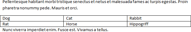
Perhaps the least ugly solution is to add an empty paragraph (with small text and suitable paragraph spacing) immediately after the table.
This is yet another problem that simply does not exist in HTML + CSS, where you can set padding, border, and margin the same way on any element, including tables.
-
If you have a table that does fit on a single page, you might want to make sure that no page break occurs inside it. To do this, select the entire table except the last row of it and apply the ‘Keep with next’ paragraph setting. (You might also want to apply the ‘Keep lines together’ option on the entire table.)
If the table fits precisely on a page (that is, if it fits on a page but occupies all of it), you might want to enable the ‘Page break before’ option on the first row of the table. (An inferior solution in the latter case is to insert a manual page break (Ctrl+Return) before the table, and remove superfluous paragraph breaks next to it.)
Fields and bookmarks
-
We have seen a number of fields in previous articles, such as
SEQ,REF, andPageRef. In a footer you might usePAGEandNumPagesto display the current page and the total number of pages. Also, things like TOCs are implemented as fields, as are hyperlinks, as displayed below.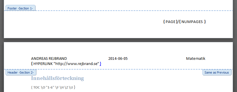
-
In addition to the field shortcuts we have discussed already, you can use Shift+F9 to toggle the display of field codes (instead of field results) in the selected fields (or the field that the caret is inside). Alt+F9 is a corresponding document-wide setting.
-
F11 selects the next field of the document, while Shift+F11 selects the previous field.
-
Shift+Ctrl+F9 replaces a field with its result as normal text (so the field is removed and the result becomes static). You can lock a field with Ctrl+F11; this way its result cannot be updated (e.g., by F9). To unlock, add the Shift modifier. Finally, Alt+Shift+F9 triggers the action associated with a few field types.
-
The
StyleReffield can be useful. The field code StyleRef "Heading 2", for instance, gives the contents of the last paragraph styled with the ‘Heading 2’ style. This field can be placed in the header, to give the name of the current chapter or section. This practice is often employed in textbooks and manuals. -
The reader probably already knows of the document-property fields such as
Title,Author,CreateDate, andFileName, as well as theDateandTimefields. -
One of my initial reactions to bookmarks was that they are not visible in the text, like fields and formatting characters (which can be shown). That made me worried about their usefulness. But then I realised that you can make them visible. Simply open the Word Options dialog box, select Advanced, ‘Show document content’, and ‘Show bookmarks’.
Sections, headers, footers, footnotes, and endnotes
-
It is possible to divide a document into sections. A section is one of the parts in a logical division of the document into parts (which is independent of things like heading styles). To mark the end of one section and the beginning of a new one, you use section breaks, which you can insert using Page Layout/Breaks.
-
There are different types of section breaks. A section break can be continuous, meaning that the new section is started immediately after the break. But a new section can also begin on a new page (a ‘Next Page’ section break). This leaves the rest of the current page empty. Finally, there are section breaks that start the new section on the next even or odd page. In practice, such a break will introduce an empty page in the document, if necessary. Of course, section breaks are handled automatically.
-
If you want, you can have different headers and footers in different sections.
-
In each section (or in the entire document), you can choose to have different headers and footers for odd and even pages. You can also choose to have a different header or a different footer on the first page. (If you don’t use sections, these settings are still useful. The first page of the document is the cover page.)
-
You can have different page formats (page size, margins, vertical alignment) in different sections. Personally, I often let the cover page of a book be a section of its own, which is centred vertically. The cover page consists of a single paragraph (the title of the book), which is then automatically centred on the page.
-
You can choose to restart footnote and endnote numbering in each new section. (Footnote numbering can even restart at each new page.) You can also choose if you want endnotes to appear at the end of the section or at the end of the document.
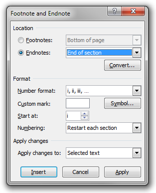
-
It is possible to change the style of footnote and endnote references; they are normal styles. By default, they are superscripted, but you may format them any way you like.
-
It is even possible to change the separator above a footnote or endnote region. By default, this is a black line. To change this separator, go to Draft mode, open the footnote window and select the separator in the combo box. You might change the colour or size of the line, or remove it and set a paragraph border. In the latter case, you might also change the right indent of the paragraph.
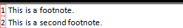
-
It is possible to insert graphics in headers and footers. In particular, it is possible to insert floating (free-moving) shapes, and these can be positioned anywhere on the page (that is, they do not need to be confined to the header or footer area). This is a useful way to add the same graphics to every page in (a section of) a document. For example, you could have the page number in a decorated text box in the middle of the page at the outer margin.
Mathematics
-
I want my set-builder notation to look like this:
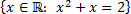
Notice the space after the colon. How to achieve this in Word? Probably the best way is to use wide space characters. For instance, one can try the EN space (U+2002) or the EM space (U+2003). One simple way to insert is to use the tokens \ensp and \emsp, respectively. I use the EN space, and have associated the keyboard shortcut Ctrl+Space to it.
-
Sometimes the automatic spacing in formulae can be improved by manual tweaking using ‘phantoms’ and ‘smashes’. In a blog post of Microsoft employee Murray Sargent, two examples are given.
First up is
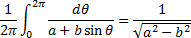
By writing \hsmash\pi instead of merely \pi, the π will be rendered but its width will be ignored. So you get
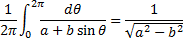
The other example given is

Notice that the second square root is bigger than the first one. This is fixed by replacing y by \dsmash(y) which ignores the descender of y:

Apparently, Murray Sargent learned this trick from Donald Knuth.
Finally, in the comments to the blog post, commenter Nali noticed that

doesn’t look good because of the excessive height of the radical. This can also be fixed by smashing the descender:

There seems to be a bug in Microsoft Word 2010 (at least) related to smashing, however.
-
In general, Murray Sargent’s blog is great. He has also authored a complete specification for the formula editor’s ‘linear format’ which you use to enter formulae. Implicitly, it also reveals all the features supported by the formula component.
-
I always end my proofs with a “∎” (U+220E: END OF PROOF) at the right margin of the last line. To simplify this, I have added a Math AutoCorrect token \qed for the symbol. Then, when I am done with a proof, I set a right-aligned tab stop at the right margin of the last paragraph, insert a tab character, and type \qed.
-
I just considered the possibility of simplifying this further, and wrote the following VBA macro:
Sub InsertQED()
    Selection.ParagraphFormat.TabStops.ClearAll
    Selection.ParagraphFormat.TabStops.Add _
      Position:=Selection.PageSetup.PageWidth _
        - Selection.PageSetup.RightMargin _
        - Selection.PageSetup.LeftMargin, _
      Alignment:=wdAlignTabRight
    Selection.InsertAfter (vbTab & ChrW(8718))
    Selection.InsertParagraphAfter
    Selection.Collapse Direction:=wdCollapseEnd
    Selection.ParagraphFormat.Style = wdStyleNormal
End Sub
I then assigned the keyboard shortcut Alt+Shift+Ctrl+Q to it. Extremely convenient!